 Skip to content
Humans are largely visual learners, and all different types of publications are starting to use infographics and visuals to appeal to these natural tendencies. According to visualization researcher Fernanda Viegas in the 2010 film “Journalism in the Age of Data,” “Half of our brain is hardwired for vision. Vision is the biggest bandwidth that we have in terms of sensory information to the outside world.” Consuming information visually makes it easier to understand and analyze, especially when the information is large amounts of data. New developments in technology allow for better visualizations, and the natural human attraction to these graphics fuels continuing popularity of data visualizations and infographics.
Seeing information allows us to comprehend it differently than if we simply read the data or heard it recited. Aaron Koblin, also featured in the film “Journalism in the Age of Data,” created a data visualization and explains just how useful it can be: “It’s one thing to say there are 140,000 planes in the sky above us, and that kind of registers. But at the same time if you can see the ebb and flow of the system you can make insights about population distribution, about infrastructure, about the decisions that are being made by air traffic controllers.” Creating visuals to display data allows for a deeper level of comprehension and analysis.
Interactivity with this data can help us understand it even further and makes it more entertaining. The New York Times realized this trend early on and now has an entire page on their website dedicated to infographics and interactives on all topics from the Olympics to elections, business, culture and more.

As they become more popular, blogs, magazines and newspapers often use infographics to attract readers. Others attempt to encourage clickthroughs by making sure to include “[INFOGRAPHIC]” in their tweets with a link to the visualization. While these can be incredibly helpful and have changed the way we consume some information, they aren’t always necessary. An infographic should display data in a way that the viewer can visually understand it, not simply put numbers inside shapes, use color and different fonts.
There are many websites and blogs that criticize and discuss infographics. For example, this tumblr page features examples of unnecessary and confusing infographics, like the photo pasted below, originally taken from www.human.org.au. It takes a few moments of reading to simply understand what it’s about. Its creator scattered some sentences around the page and extracted percentages only to display them out of context and in bright colors. It would be easier to comprehend this information if it were in paragraph form. Using different colors and sizes can sometimes help us organize information on a page by looking at it, but using too many can also hinder comprehension.

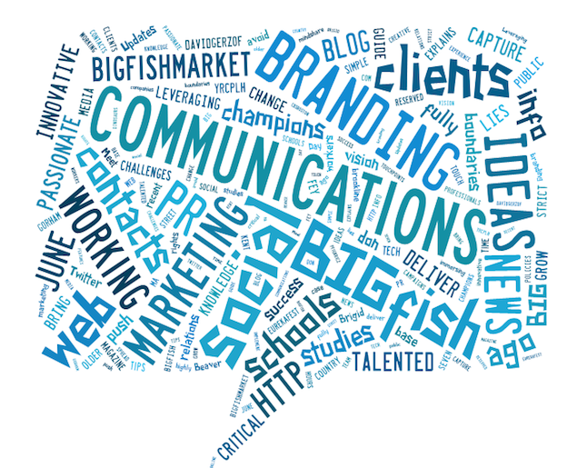
When used correctly infographics can be helpful, interesting, and fun. You can create your own with a variety of tools online. Check out our simple graphic below, created using tagxedo. This image enables a viewer to see what BIGfish is all about at a glance. Words used most commonly on our website are displayed in larger fonts. You can perceive and interpret the information more quickly than if the information was presented in sentences or even a chart. Data visualizations are here to stay, and can help drive traffic your website or blog by appealing to the visual nature of humans as long as you know what you want to convey to your audience and carefully consider the best way of doing so.
