Ah, rebranding. It can be an amazing tool, especially for companies that have been around for decades and need a little refreshing. On the other hand, rebranding can also become a company’s biggest pain in the butt. Although there are plenty of examples of successful rebranding, there are so many more examples of it going horribly wrong. Here are a few rebrands that we love to hate.
1) Gap


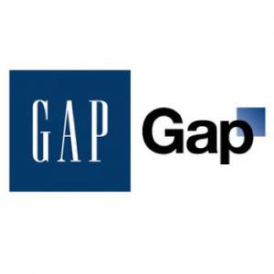
An oldie but a goodie, the tale of the Gap rebranding disaster of 2010 has all the drama you could ever wish for. Gap’s old logo on the left, which served the brand for over 20 years, was, without warning, replaced by the logo on the right. The word “Gap” in bold, plain font with a seemingly random gradient square floating in the corner left many people in the design community, as well as Gap’s customers, scratching their heads. Within a matter of days, the Internet had spoken: everyone hated it. Then, in a quasi-magical turn of events, Gap heard what its customers were saying about the new logo and, in just six days, completely reversed all the rebranding they had done. Although we’ve got to commend Gap for responding to negative feedback so quickly, the ordeal still cost them about $100 million in the end.
2) Tropicana

Tropicana’s rebranding failure is a different story altogether. Unlike the other brands on this list, most people agreed that Tropicana’s new fresh, clean and modern look was better than the original. However, Tropicana lost their brand identity in the redesign; without the signature orange and straw on their cartons, Tropicana’s orange juice simply ended up looking too generic. As a result of the rebrand, Tropicana’s sales figures plummeted by an astonishing 20%.
3) Overstock

When Overstock announced that they were launching a new website called O.co that would redirect to their original site (Overstock.com), the rebrand became test of the average person’s attention to detail. The result? Almost everyone failed. Overstock customers instinctively typed in O.com and ended up staring at a big old “error” screen. Overstock lost a considerable number of visitors and sales but have stuck to their O.co campaign to this day.
4) Kraft


In a dramatic turn for the bland, Kraft changed their logo in 2009 from a household favorite to an odd, multicolored mess that was also suspiciously similar to Yoplait’s logo. While Kraft’s attempt was well-intentioned, the logo change created quite a lot of negative buzz among their stakeholders. After months of receiving complaints about the branding change, Kraft finally decided to go back to something similar to their old logo. At least they tried.
5) The Olympic Games


The Olympic Games might seem like a surprising addition to the list, but ever since the early ‘00s, it seems like they’ve been doing their best to come up with the weirdest logos they possibly can. Although each logo contains the Olympic rings, they also feature some crazy bright colors and abstract images.
With the global name recognition that the Olympic Games has, do they really need to get flashy with their logo? We think not. It just goes to show that messing with one of the most iconic logos of all time might not be the wisest move.
Think of any rebranding fails that didn’t make the list? Share your thoughts in the comments below or tweet us @BIGfishPR!

